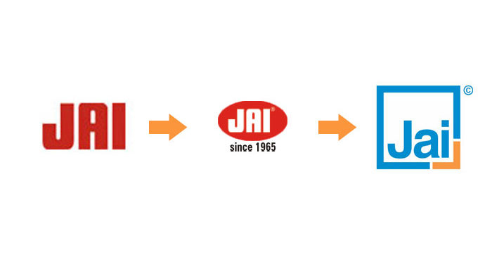
Previous logo design for the brand


New logo design identity for JAI (from Jan-2006 onwards)
New Vision
Our focus and goal is to achieve excellence in all areas of operation by meeting the stringent requirements of domestic & overseas customers
New Identity
With new-age design logo, new international trend in all communication and design aspects. Jai has adopted highly professional work-culture too.
New System
M/cs available in 3 standard series.
i.e. Max = highest quality,
Master = Sturdy, proven m/cs,
Popular = Economy range.
Also, Customer friendly catalogues and manuals.
Understanding the significance of new design

It signals a new era of growth for JAI. Embodying modern and international elements of simplicity, decency and uniqueness.
This is how we can understand it…
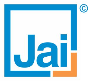
• Perfect square, its sharp edges/corners and a special cut-corner suits engineering segment and suggests precision.
• Clean look and bright blue color stand for company’s honest approach and cool-headed leadership position.
• The out-standing and striking orange cut-corner indicates uniqueness of the logo and thus, the company. We interpret 90% of blue and 10% of orange colour thus: A blue blood, cool, composed and mature company is young at heart! Capable of required measures of smartness, aggressiveness and innovations.
…and the new credo: ‘spirit of excellence’

Excellent Engineering
Qualitative manufacturing
Committed services

